Demo: Spatial data from Slide-seq
This demo uses data from:
Slide-seq: A scalable technology for measuring genome-wide expression at high spatial resolution
- Rodriques et al (Science 2019)
- https://doi.org/10.1126/science.aaw1219
For this demo, you need the data files for Puck_180819_12
Taken from: https://portals.broadinstitute.org/single_cell/study/SCP354/slide-seq-study#study-summary
Specifically these two files:
- MappedDGEForR.csv
- BeadMapping_10-17_1014/BeadLocationsForR.csv
Covered Here
- Data preprocessing and filtering
- Computing Autocorrelation in Hotspot to identify spatial genes
- Computing local correlations between spatial genes to identify modules
- Plotting modules, correlations, and module scores
[1]:
import numpy as np
import pandas as pd
import hotspot
import matplotlib.pyplot as plt
import matplotlib.colors
import seaborn as sns

# Load the counts and positions
counts_file = 'MappedDGEForR.csv'
pos_file = 'BeadMapping_10-17_1014/BeadLocationsForR.csv'

pos = pd.read_csv(pos_file, index_col=0)
counts = pd.read_csv(counts_file, index_col=0) # Takes a while, ~10min

# Align the indices
counts = counts.loc[:, pos.index]
barcodes = pos.index.values

# Swap position axes
# We swap x'=y and y'=-x to match the slides in the paper
pos = pd.DataFrame(
    {
        'X': pos.ycoord,
        'Y': pos.xcoord*-1,
    }, index=pos.index
)

num_umi = counts.sum(axis=0)

# Filter genes
gene_counts = (counts > 0).sum(axis=1)
valid_genes = gene_counts >= 50
counts = counts.loc[valid_genes]
Creating the Hotspot object
To start an analysis, first creat the hotspot object When creating the object, you need to specify:
- The gene counts matrix
- Which background model to use
- The latent space we are using to compute our cell metric
- Here we use the physical barcode positions
- The per-cell scaling factor
- Here we use the number of umi per barcode
Once the object is created, the neighborhood graph must be computed with create_knn_graph
The two options that are specificied are n_neighbors which determines the size of the neighborhood, and weighted_graph.
Here we set weighted_graph=False to just use binary, 0-1 weights and n_neighbors=300 to create a local neighborhood size of the nearest 300 barcodes. Larger neighborhood sizes can result in more robust detection of correlations and autocorrelations at a cost of missing more fine-grained, smaller-scale, spatial patterns
[2]:
# Create the Hotspot object and the neighborhood graph

hs = hotspot.Hotspot(counts, model='bernoulli', latent=pos, umi_counts=num_umi)

hs.create_knn_graph(
    weighted_graph=False, n_neighbors=300,
)
Determining genes with spatial variation
Now we compute autocorrelations for each gene, using the spatial metric, to determine which genes have the most spatial variation.
[3]:
hs_results = hs.compute_autocorrelations(jobs=16)

hs_results.head()
100%|██████████| 6942/6942 [00:27<00:00, 250.89it/s]
[3]:
| G | EG | stdG | Z | C | Pval | FDR | |
|---|---|---|---|---|---|---|---|
| Gene | |||||||
| Ttr | 1.895617e+06 | 0 | 4349.885976 | 435.785413 | 0.195658 | 0.0 | 0.0 |
| Plp1 | 1.070512e+06 | 0 | 4349.885976 | 246.101150 | 0.109810 | 0.0 | 0.0 |
| Enpp2 | 9.047060e+05 | 0 | 4349.885976 | 207.983833 | 0.099028 | 0.0 | 0.0 |
| Fth1 | 9.041625e+05 | 0 | 4349.885976 | 207.858890 | 0.092616 | 0.0 | 0.0 |
| Cartpt | 7.867150e+05 | 0 | 4349.885976 | 180.858760 | 0.084189 | 0.0 | 0.0 |
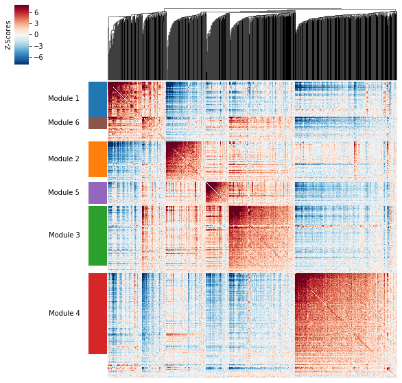
Grouping genes into spatial modules
To get a better idea of what spatial patterns exist, it is helpful to group the genes into modules.
Hotspot does this using the concept of “local correlations” - that is, correlations that are computed between genes between cells in the same neighborhood.
Here we avoid running the calculation for all Genes x Genes pairs and instead only run this on genes that have significant spatial autocorrelation to begin with.
The method compute_local_correlations returns a Genes x Genes matrix of Z-scores for the significance of the correlation between genes. This object is also retained in the hs object and is used in the subsequent steps.
[4]:
# Select the genes with significant spatial autocorrelation
hs_genes = hs_results.index[hs_results.FDR < 0.05]

# Compute pair-wise local correlations between these genes
lcz = hs.compute_local_correlations(hs_genes, jobs=20)
0%| | 0/845 [00:00<?, ?it/s]
Computing pair-wise local correlation on 845 features...
100%|██████████| 845/845 [00:05<00:00, 157.16it/s]
100%|██████████| 356590/356590 [59:29<00:00, 99.89it/s]
Now that pair-wise local correlations are calculated, we can group genes into modules.
To do this, a convenience method is included create_modules which performs agglomerative clustering with two caveats:
- If the FDR-adjusted p-value of the correlation between two branches exceeds
fdr_threshold, then the branches are not merged. - If two branches are two be merged and they are both have at least
min_gene_thresholdgenes, then the branches are not merged. Further genes that would join to the resulting merged module (and are therefore ambiguous) either remain unassigned (ifcore_only=True) or are assigned to the module with the smaller average correlations between genes, i.e. the least-dense module (ifcore_only=False)
The output is a Series that maps gene to module number. Unassigned genes are indicated with a module number of -1
This method was used to preserved substructure (nested modules) while still giving the analyst some control. However, since there are a lot of ways to do hierarchical clustering, you can also manually cluster using the gene-distances in hs.local_correlation_z
[5]:
modules = hs.create_modules(
    min_gene_threshold=20, core_only=False, fdr_threshold=0.05
)

modules.value_counts()
[5]:
 4    230
 3    170
-1    143
 2    102
 1    101
 5     63
 6     36
Name: Module, dtype: int64
Plotting module correlations
A convenience method is supplied to plot the results of hs.create_modules
[6]:
hs.plot_local_correlations()
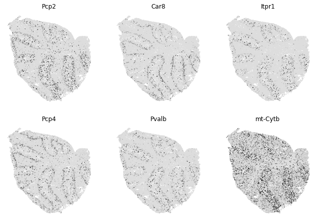
To explore individual genes, we can look at the genes with the top autocorrelation in a given module as these are likely the most informative.
[7]:
# Show the top genes for a module

module = 1

results = hs.results.join(hs.modules)
results = results.loc[results.Module == module]
results.sort_values('Z', ascending=False).head(10)
[7]:
| G | EG | stdG | Z | C | Pval | FDR | Module | |
|---|---|---|---|---|---|---|---|---|
| Gene | ||||||||
| Pcp2 | 454045.514481 | 0 | 4349.885976 | 104.381015 | 0.046222 | 0.0 | 0.0 | 1.0 |
| Car8 | 384470.481798 | 0 | 4349.885976 | 88.386336 | 0.039361 | 0.0 | 0.0 | 1.0 |
| Itpr1 | 309992.054843 | 0 | 4349.885976 | 71.264409 | 0.031606 | 0.0 | 0.0 | 1.0 |
| Pcp4 | 287016.421190 | 0 | 4349.885976 | 65.982516 | 0.029496 | 0.0 | 0.0 | 1.0 |
| Pvalb | 277574.727119 | 0 | 4349.885976 | 63.811955 | 0.028504 | 0.0 | 0.0 | 1.0 |
| mt-Cytb | 251459.913992 | 0 | 4349.885976 | 57.808392 | 0.025916 | 0.0 | 0.0 | 1.0 |
| Gpm6b | 229566.984067 | 0 | 4349.885976 | 52.775403 | 0.023639 | 0.0 | 0.0 | 1.0 |
| mt-Nd4 | 226437.069373 | 0 | 4349.885976 | 52.055863 | 0.023182 | 0.0 | 0.0 | 1.0 |
| Calb1 | 198838.797756 | 0 | 4349.885976 | 45.711267 | 0.020217 | 0.0 | 0.0 | 1.0 |
| Aldoc | 187057.748608 | 0 | 4349.885976 | 43.002909 | 0.019332 | 0.0 | 0.0 | 1.0 |
To get an idea of what spatial pattern the module is referencing, we can plot the top module genes’ expression onto the spatial positions
[9]:
# Plot the module scores on top of positions

module = 1

results = hs.results.join(hs.modules)
results = results.loc[results.Module == module]
genes = results.sort_values('Z', ascending=False).head(6).index

fig, axs = plt.subplots(2, 3, figsize=(11, 7.5))

cmap = matplotlib.colors.LinearSegmentedColormap.from_list(
    'grays', ['#DDDDDD', '#000000'])

for ax, gene in zip(axs.ravel(), genes):

    expression = np.log2(hs.counts.loc[gene]/hs.umi_counts*45 + 1) # log-counts per 45 (median UMI/barcode)

    vmin = 0
    vmax = np.percentile(expression, 95)
    vmax = 2

    plt.sca(ax)
    plt.scatter(x=hs.latent.iloc[:, 0],
                y=hs.latent.iloc[:, 1],
                s=2,
                c=expression,
                vmin=vmin,
                vmax=vmax,
                edgecolors='none',
                cmap=cmap
               )

    for sp in ax.spines.values():
        sp.set_visible(False)

    plt.xticks([])
    plt.yticks([])
    plt.title(gene)
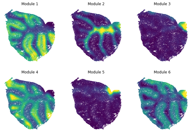
Summary Module Scores
To aid in the recognition of the general behavior of a module, Hotspot can compute aggregate module scores.
[10]:
module_scores = hs.calculate_module_scores()

module_scores.head()
0%| | 0/6 [00:00<?, ?it/s]
Computing scores for 6 modules...
100%|██████████| 6/6 [01:30<00:00, 12.98s/it]
[10]:
| 1 | 2 | 3 | 4 | 5 | 6 | |
|---|---|---|---|---|---|---|
| barcodes | ||||||
| CGTACAATTTTTTT | 0.822729 | -0.443706 | -0.094899 | -0.414559 | -0.198448 | 0.180391 |
| TTCGTTATTTTTTT | 1.232227 | -0.421417 | -0.254999 | -0.472261 | -0.213982 | 0.299108 |
| CAAACCAACCCCCC | 0.607751 | -0.312146 | -0.166309 | 0.234819 | -0.328414 | 0.367822 |
| TCTTTTCACCCCCC | 1.286320 | -0.491108 | -0.053740 | -0.736092 | -0.096152 | 0.377854 |
| GGATTGAACCCCCC | 0.133101 | -0.544696 | -0.157040 | -0.326436 | -0.133297 | 0.334153 |
Here we can visualize these module scores by plotting them over the barcode positions:
[11]:
# Plot the module scores on top of positions

fig, axs = plt.subplots(2, 3, figsize=(11, 7.5))

for ax, module in zip(axs.ravel(), range(1, hs.modules.max()+1)):
    scores = hs.module_scores[module]

    vmin = np.percentile(scores, 1)
    vmax = np.percentile(scores, 99)

    plt.sca(ax)
    plt.scatter(x=hs.latent.iloc[:, 0],
                y=hs.latent.iloc[:, 1],
                s=2,
                c=scores,
                vmin=vmin,
                vmax=vmax,
                edgecolors='none'
               )

    for sp in ax.spines.values():
        sp.set_visible(False)

    plt.xticks([])
    plt.yticks([])
    plt.title('Module {}'.format(module))